Je M'en Fous
Logotype and branding applications for a downtown cafe bar with French bistro style.
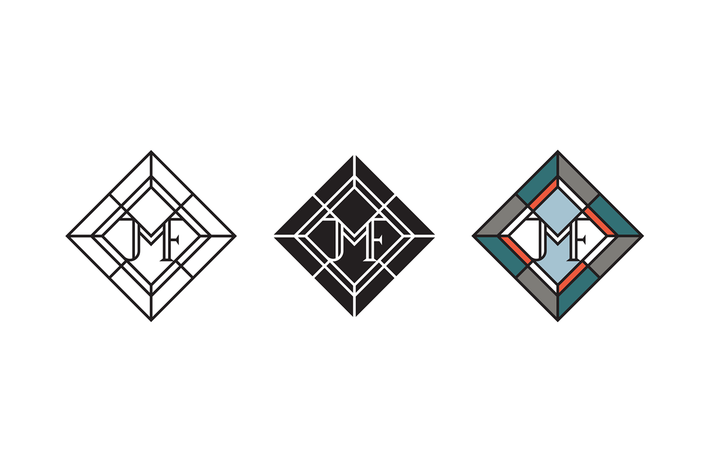
We designed the logotype imitating the vitraux technique, a monumental decorative expression that moves people for centuries. We locate the monogram JMF nested into the vitraux rhombus, followed by the typography, both in serif family fontypes.
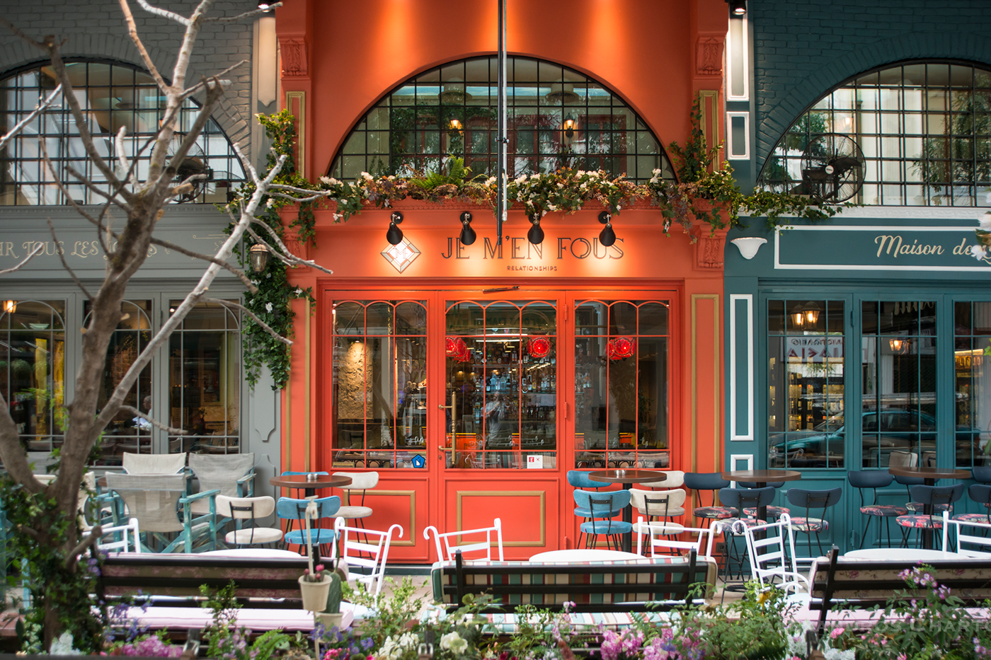
The front side of the bistrot is chromatically spitted in three parts, giving the impression of three separate little stores side by side, reminding the early 20th century Parisian bistros, with the central one hosting the brand and the adjacent acting the competitors.
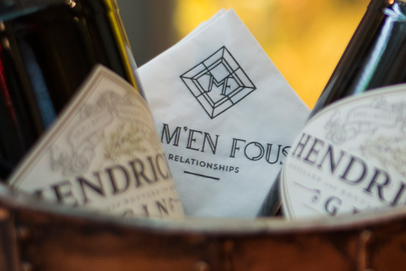
Among the plethora of the branding applications we highlight the place mats, which are giving the impression of a vitraux surface, the napkins, which are bright white to emphasize the single color logotype in their corner, as well as all these applications which are using the floral aesthetic as a common point of reference, such as stools, aprons with needle points and take away cups.
CREDITS
Photoshooting: Alexandros Chartonas
Handmade signs: Valentino Valassis